It is possible to configure the appearance of the FaceMatch video by providing an additional CSS file named custom-video-identification.css, provided in the signbook customization.zip archive ().
This CSS file can contain your own CSS, but the recommended method is to use the CSS variables listed below:
| CSS Variable | Default value | Description |
|---|---|---|
| --nc-font-family | 'Quicksand', sans-serif; | global text font |
| --nc-font-weight | 500 | font-weight for global text |
| --nc-font-color | #333333 | global text color |
| --nc-font-size | 1rem | global font size |
| --nc-button-active-background | #014AD8 | background color for buttons |
| --nc-button-active-color | #FFFFFF | text color for buttons |
| --nc-button-disabled-background | rgba (47, 95, 227, 0.25) | background-color for disabled buttons |
| --nc-button-disabled-color | rgba (255, 255, 255, 0.8) | text color for disabled buttons |
| --nc-button-font-size | 16px | text size for buttons |
| --nc-button-font-weight | bold | font-weight for text in buttons |
| --nc-button-text-transform | uppercase | can be used to make button text appear in uppercase or lowercase |
| --nc-button-border-radius | 8px | border-radius size for buttons |
| --nc-checkbox-container-checked-background | #FFFFFF | checkbox container background color when selected |
| --nc-checkbox-background | #2F5FE3 | background-color for checkboxes |
| --nc-checkbox-checkmark-color | #FAFAFA | checkbox color when selected |
| --nc-checkbox-border-color | ##014AD8 | border color of the checkbox |
| --nc-checkbox-width | 20px | checkbox width size |
| --nc-checkbox-height | 20px | checkbox height size |
| --nc-link-color | #014AD8 | link text color |
| --nc-box-background | rgba (1, 74, 216, 0.03) | background color for the box panel in first step |
| --nc-box-border-radius | 8px | border-radius for the box panel in first step |
| --nc-box-document-type-background | #FFFFFF | background-color for item selection in document type step |
| --nc-box-document-type-border-radius | 8px | border-radius for item selection in document type step |
| --nc-progress-bar-background | #014AD8 | background color for the progress bar in upload step |
| --nc-validation-color | #1af9b6 | color used in animations during video recording screens |
| --nc-live-control-succeed-color | rgb (25, 216, 115) | color indicating that the real-time control over sharpness is on |
| --nc-live-control-fail-color | rgb (255, 57, 57) | color indicating that the real-time control on sharpness is not passing |
:root {
--nc-font-family: 'Courgette', serif;
--nc-font-color: black;
--nc-font-size: 16px;
--nc-font-weight: 400;
--nc-button-active-background: #22819f;
--nc-button-active-color: #affffa;
--nc-button-disabled-background: rgba(174, 206, 214, 0.5);
--nc-button-disabled-color: gray;
--nc-button-font-size: 16px;
--nc-button-font-weight: bold;
--nc-button-border-radius: 40px;
--nc-button-text-transform: none;
--nc-checkbox-container-checked-background: transparent;
--nc-checkbox-background: #22819f;
--nc-checkbox-checkmark-color: #affffa;
--nc-checkbox-border-color: #014AD8;
--nc-checkbox-width: 26px;
--nc-checkbox-height: 26px;
--nc-link-color: #014AD8;
--nc-box-background: #baf7ff;
--nc-box-border-radius: 20px;
--nc-box-document-type-background: #baf7ff;
--nc-box-document-type-border-radius: 40px;
--nc-progress-bar-background: #56dfb0;
--nc-validation-color: #1ac6ff;
--nc-live-control-succeed-color: #1ac6ff;
--nc-live-control-fail-color: #ff0071;
}
@font-face {
font-family: 'Courgette';
font-style: normal;
font-weight: 400;
src: url(https://fonts.gstatic.com/s/courgette/v13/wEO_EBrAnc9BLjLQAUk1VvoK.woff2) format('woff2');
unicode-range: U+0000-00FF, U+0131, U+0152-0153, U+02BB-02BC, U+02C6, U+02DA, U+02DC, U+2000-206F, U+2074, U+20AC, U+2122, U+2191, U+2193, U+2212, U+2215, U+FEFF, U+FFFD;
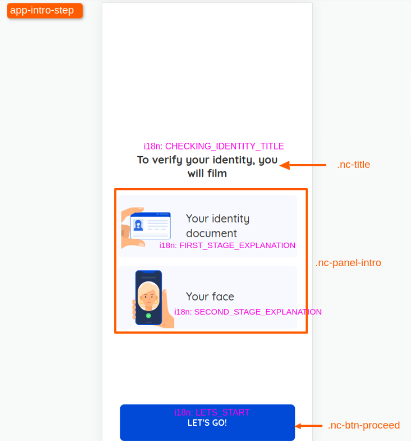
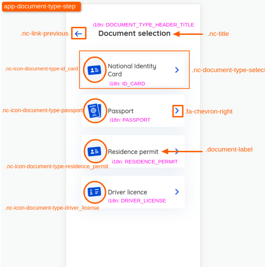
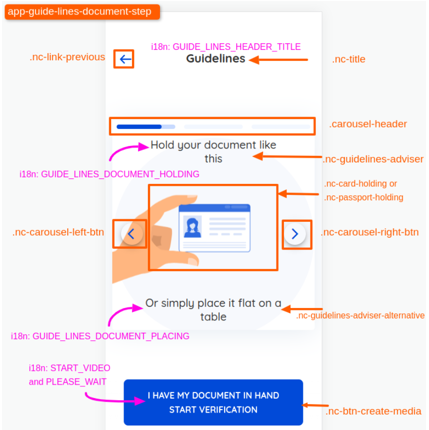
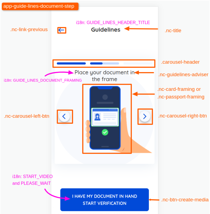
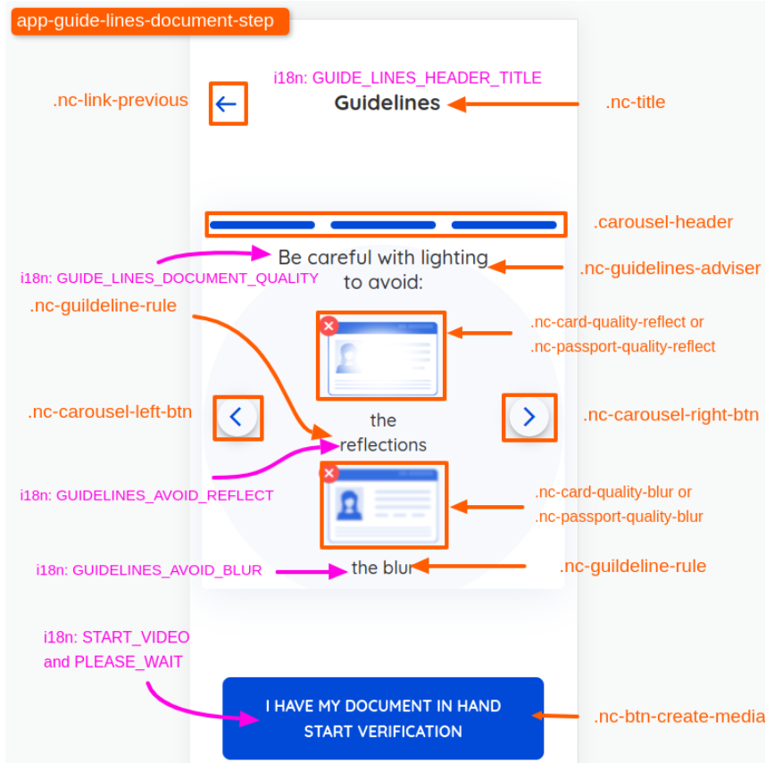
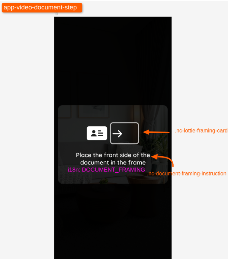
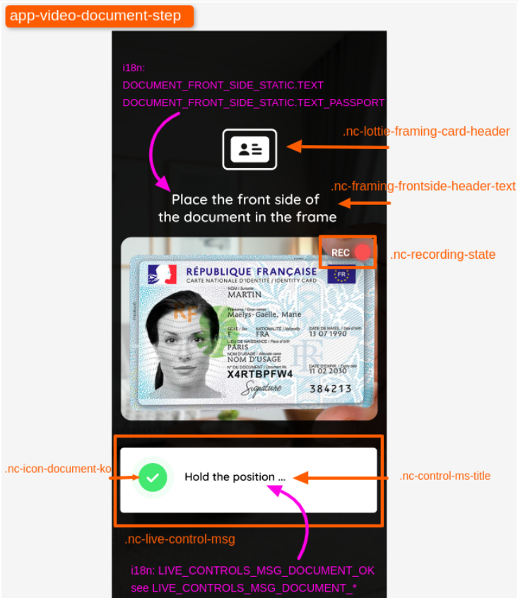
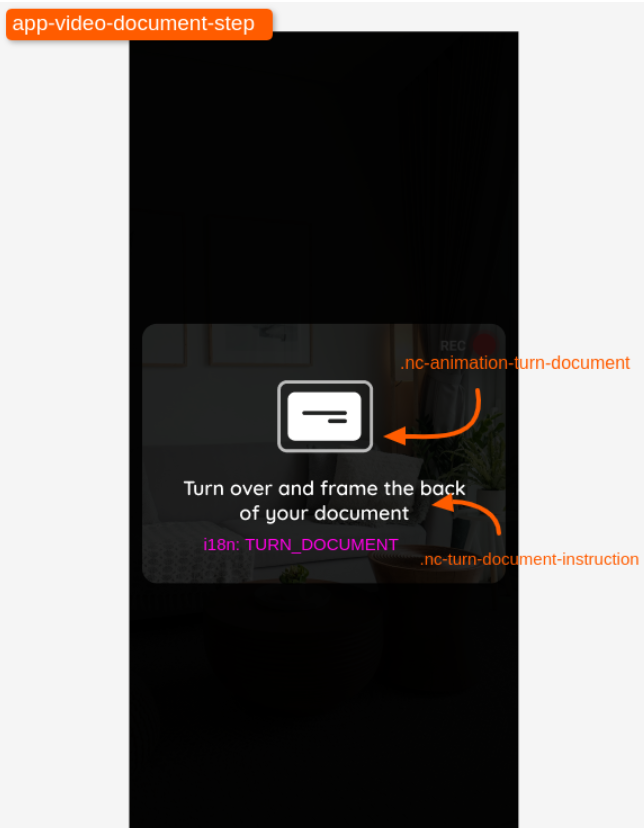
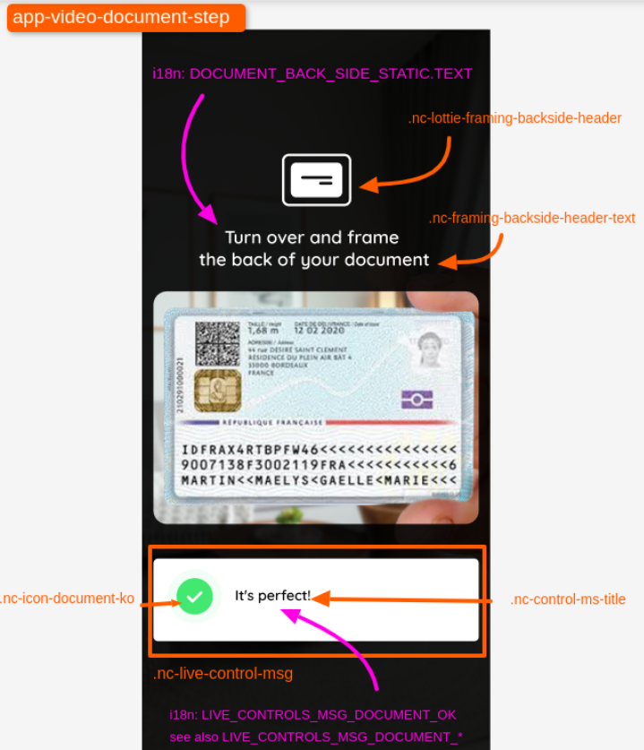
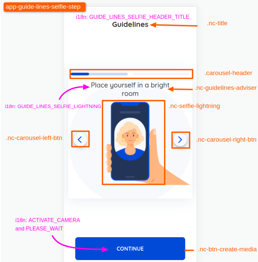
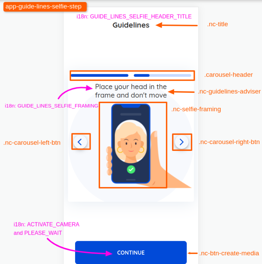
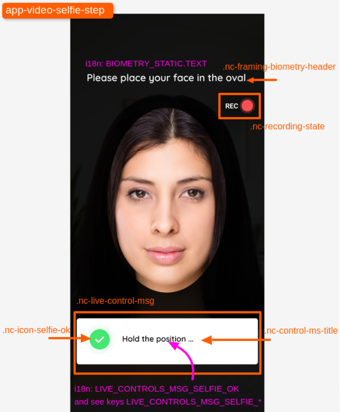
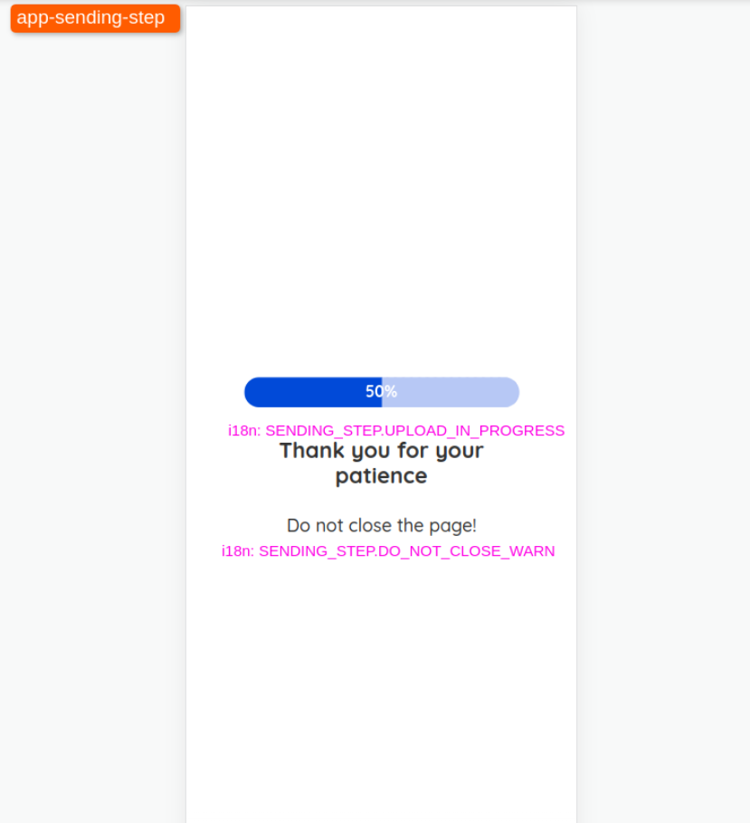
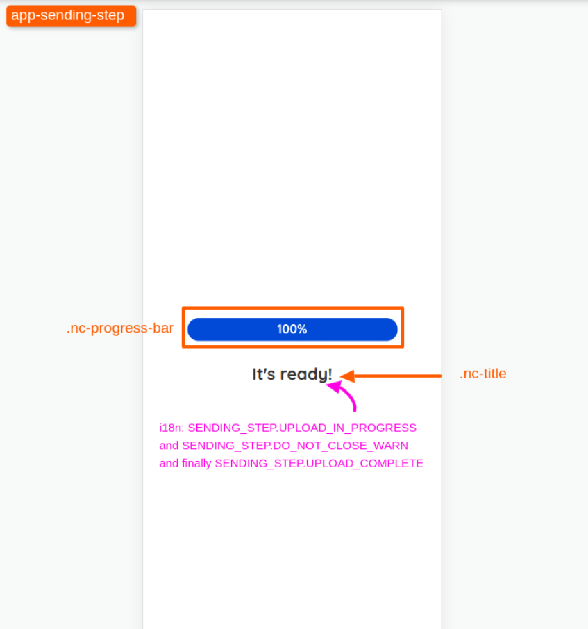
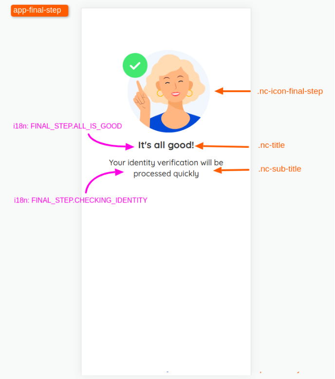
}Several CSS classes in the interface are easily identifiable with a browser developer's tool, We list below the main CSS classes to be used to target each page element:
To achieve full visual integration, in addition to the appearance, you can configure the interface texts for video identification, by supplying an additional file named strings. custom-video-identification_[lang].json to be included in the SignBook customization ZIP archive.
strings. custom-video-identification__[lang]_.json: Used to redefine texts for the selected language. Replace [lang] with the corresponding language code (example: fr or en). It is advisable to use a suitable editor (e.g. Notepad++) to edit this file in JSON FORMAT. Note that this file must be encoded in UTF-8.
Customization files available :
- strings.custom-video-identification_fr.json: Default file
- strings.custom-video-identification_en.json: English file
- strings.custom-video-identification_it.json: Italian file
- strings.custom-video-identification_es.json: Spanish file
- strings.custom-video-identification_nl.json: Dutch file
- strings.custom-video-identification_pt.json: Portuguese file
- strings.custom-video-identification_ro.json: Romanian file
- strings.custom-video-identification_de.json: German file
- strings.custom-video-identification_hr.json: Croatian file
It is recommended to redefine only those keys you feel need to be changed. If you do not wish to modify certain keys, you do not need to provide them, as the default value will automatically be used.